
In the competitive sports landscape, franchises are frequently presented with tough decisions concerning their identities and evolution. One such question constantly on the minds of Denver Broncos fans is: should they trade up and modernize their identity or double down and return to their iconic orange “D” logo? On the one hand, the trend in all things branding these days seems to demand crisp redesigns and sleek, adaptable marks. On the other, the Broncos “D” logo has become such a recognizable symbol that to trade it up would risk losing an authentic piece of our identity.
But from a personal perspective, I think trading up and redesigning is alluring to say the least, but ultimately, the Broncos would be better served by doubling down on the orange “D” logo. It is iconic and holds a special place in my heart as well as a host of other Broncos fans.
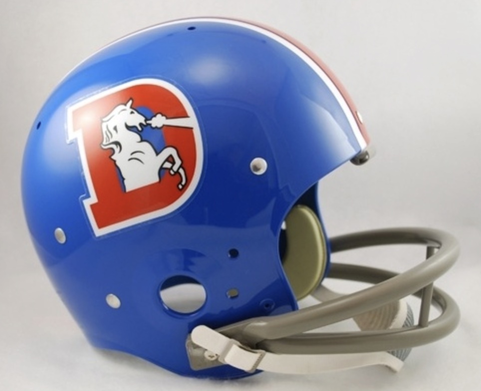
The “D” was first introduced by the Broncos in 1968. It consisted of a white horse with his mouth open and snorting in the middle of an orange “D” with a blue outline. For the next 30 years, the Broncos “D” rode through the roller coaster of team fortunes, from heartbreaking Super Bowl losses in the 70s and 80s, to finally bringing home that first Lombardi Trophy in 1998, led by John Elway and his sky-grabbing helicopter arm. I think the “D” logo will be remembered as the symbol of perseverance, grit and eventually, team triumph.
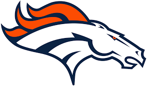
Fans have long since held a special place for the “D.” In 1997, the Broncos made a jump to their current “running horse” logo. A sleek and modern logo for its time, the head of a chestnut-colored horse depicted in motion leaping towards an orange and blue mountain range, it did not quite capture the hearts of fans like the original logo. I feel the running horse lacks a certain “wow factor” of the original “D.” Bold, unapologetic and representative of the region, the “D” is unmistakably Denver. As much as possible, I would suggest sticking with that.
Aside from fan loyalty, a return to the old logo would also make a ton of business sense. Retro merchandise is a huge trend across all major leagues, with the NBA’s “Classic Edition” jerseys and Major League Baseball’s throwback caps both selling out almost immediately.
Broncos throwback merchandise already outsells the regular line-up on the NFL Shop, with the “D” appearing on one of the most common throwback jersey styles. I have made that purchase. I am someone that, when buying merchandise, will often look for the Broncos stuff with the “D” logo as opposed to the current emblem. Broncos merchandise sales would likely explode with a permanent return of the old logo, unifying old and young generations.
The logo of a team also serves a critical role in representing and shaping the cultural identity of its fan base and city. The Broncos “D” logo tells the story of Denver’s growth into a football town, its resilience in the face of sporting hardship, and eventually its place as a proud football city. Fans will often express the Denver Broncos “D” logo reminds them of everything from the vibrating bleachers of Mile High Stadium to the Orange Crush defenses and the city’s development into a football town. A logo that represents more than just the team, but the place, remains timeless.
The only argument I can really see being made for the idea of trading up from the “D” logo would be that modern audiences demand sleek, optimized logos that are as adaptable to social media and digital formats as to traditional apparel. They would say that while the “D” may have been iconic in its heyday, now it risks being outdated in an era defined by simple, streamlined design.
However, what makes a truly great logo is timeless design. A logo that will stick with the fans well after a particular team craze is finished. The Chicago Bears’ “C,” the Green Bay Packers “G” and the Dallas Cowboys’ star are all extremely simple marks that have thrived in branding throughout their lengthy histories. I believe the Broncos’ “D” deserves the same level of iconic, lasting reverence.
In conclusion, I personally think sports should never be about the superficial flash and packaging of brand-building. We support our teams and buy jerseys not for the latest logo designs but for a sense of community, history and shared identity. A return to the Broncos “D” logo will let Broncos fans know that this is a team that respects its history while looking to the future.
Change does not always mean progress. Progress does not always mean jumping ship. So while the Broncos look to a new era of football in the Mile High City, let us remember to ride on the back of a mighty symbol, one that rides through the history of Broncos football: the bold and iconic orange “D.”

Leave a comment